Apotek Hjärtat
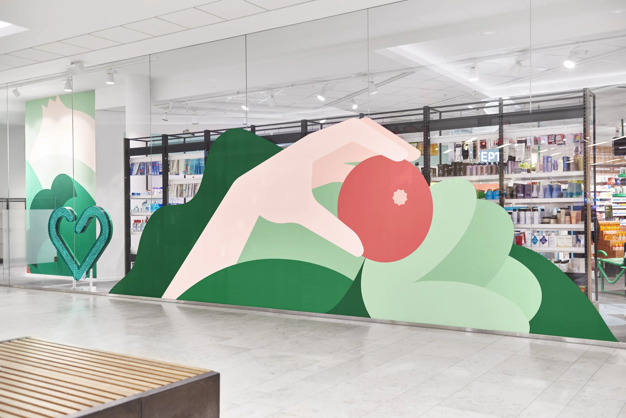
In Sweden, many pharmacies look more or less the same and people seldom know what store they’re in. Based on their visual identity, we created a new graphic language to clearly distinguish Apotek Hjärtat’s retail spaces from their competitors. A flexible design system that work across the pharmacy chains many different store layouts and communication channels.
Agency: Bold (Stockholm). Illustration: Rob Bailey. Production: BKRY


